

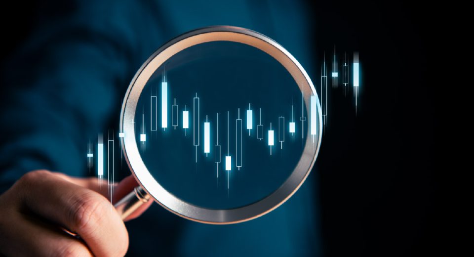
Simplest Guide to Trading the Golden Cross Pattern

The Golden Cross pattern is a powerful bullish signal. It suggests a strong upward price move is starting. Both long-term and short-term trading strategies can use this candlestick pattern to identify bullish trend reversals and continuations. It helps traders determine entry and exit points, as well as stop loss and take profit levels.
What Does the Golden Cross Pattern Look Like?
This candlestick pattern involves two important moving averages (MAs):
- 50-day Simple Moving Average (SMA): This is the shorter-term average. It reacts faster to recent price changes.
- 200-day Simple Moving Average (SMA): This is the longer-term average. It represents the broader market trend.
The Golden Cross pattern occurs in three stages:
Stage 1 (Downtrend): The short-term 50-day MA is below the long-term 200-day MA. This shows the market is in a downtrend. The price has been generally falling.
Stage 2 (The Cross): The 50-day MA crosses above the 200-day MA. This is the actual Golden Cross. It is the key buy signal. It shows momentum is shifting upwards and buyers are taking control.
Stage 3 (Uptrend): Both MAs trend higher. The 50-day MA stays above the 200-day MA, which confirms the new, strong uptrend.
Why Does the Golden Cross Work?
The Golden Cross pattern works because of what the MAs represent. The 50-day MA shows recent buying power, while the 200-day MA shows the overall health of the asset. When the 50-day MA crosses above the 200-day MA, it means that recent prices are higher than the long-term average price and that the short-term momentum is now stronger than the long-term trend.
This shift signals a major change. It shows that buyers are stepping in heavily. The market trend has likely changed from down or flat to up. This makes it a great indicator for long-term trading strategies.
Is the Golden Cross a Reliable Signal?
The Golden Cross often appears in major market moves. It works for stocks, indices and commodities. The pattern formed for the S&P 500 index in late 2020, when the market began to recover after the initial Covid-19 crash. The cross confirmed the long-term rally. It was a strong signal to buy. The index continued to climb for many months, reaching all-time highs. The 200-day MA then acted as a solid support level.
The pattern was also clearly visible for Apple’s stock at the beginning of 2023, when the 50-day MA crossed the 200-day MA. The stock rallied significantly through the year.
These examples show the pattern’s reliability. However, it is important to check the volume too. High volume on the day of the cross adds to its power.
Golden Cross vs. Death Cross
The Death Cross is the opposite of the Golden Cross. It signals a bearish trend reversal or continuation. Here, the 50-day MA crosses below the 200-day MA, suggesting the start of a long-term downtrend. Traders usually exit positions when this pattern appears, since it indicates that the price is likely to move downwards.
How to Trade the Golden Cross Pattern
Here are some simple steps you can follow to trade the Golden Cross pattern.
Step 1. Confirm the Cross
Look for the 50-day SMA crossing above the 200-day SMA. Wait for the candlestick pattern to close. The close confirms the crossover. Do not jump in too early.
Step 2. Enter the Trade
Open a buy positionafter the cross is confirmed. A popular entry point is the next day’s opening price. Check the trading volume. A cross with higher-than-average volume is a stronger signal. Low volume makes the signal less reliable.
Step 3. Set Your Stop-Loss & Take Profit
This is crucial. Place a stop-loss order below the 200-day MA. If the price drops below the 200-day MA, the signal is likely false. It means the expected uptrend failed. The stop-loss limits your potential losses.
Use the 200-day MA as your main support line. This is where you can place your profit target. Stay in the trade as long as the price stays above it.
Step 5. Combine with Other Tools
Although the Golden Cross is a strong and reliable signal, it is best to confirm it with other technical indicators. Use the Relative Strength Index to check momentum. A rising RSI alongside the Golden Cross confirms the strength of the trend, while a significantly overbought RSI (above 70) may suggest the trend’s potential exhaustion and a need for caution.
The pattern can also be confirmed with the Moving Average Convergence Divergence (MACD). Look for the MACD line crossing above its signal line simultaneously with the 50-day MA crossing above the 200-day MA. This indicates strengthening bullish momentum and potential for a continued uptrend. This MACD crossover should also have a positive histogram, confirming the strength of the bullish trend as the asset price moves higher.
The Golden Cross pattern is a simple, effective tool. It makes for a solid trading strategy. However, remember to use risk management measures to limit losses.
To Sum Up
- The Golden Cross pattern is a bullish reversal candlestick pattern.
- It forms when the 50-day MA crosses above the 200-day MA.
- Traders use this signal to enter buy positions.
- It is important to confirm the signal with high trading volume.
- The pattern can also be confirmed with other indicators, such as the RSI and MACD.
Disclaimer:
All data, information and materials are published and provided “as is” solely for informational purposes only, and is not intended nor should be considered, in any way, as investment advice, recommendations, and/or suggestions for performing any actions with financial instruments. The information and opinions presented do not take into account any particular individual’s investment objectives, financial situation or needs, and hence does not constitute as an advice or a recommendation with respect to any investment product. All investors should seek advice from certified financial advisors based on their unique situation before making any investment decisions in accordance to their personal risk appetite. Blackwell Global endeavours to ensure that the information provided is complete and correct, but make no representation as to the actuality, accuracy or completeness of the information. Information, data and opinions may change without notice and Blackwell Global is not obliged to update on the changes. The opinions and views expressed are solely those of the authors and analysts and do not necessarily represent that of Blackwell Global or its management, shareholders, and affiliates. Any projections or views of the market provided may not prove to be accurate. Past performance is not necessarily an indicative of future performance. Blackwell Global assumes no liability for any loss arising directly or indirectly from use of or reliance on such information here in contained. Reproduction of this information, in whole or in part, is not permitted.
